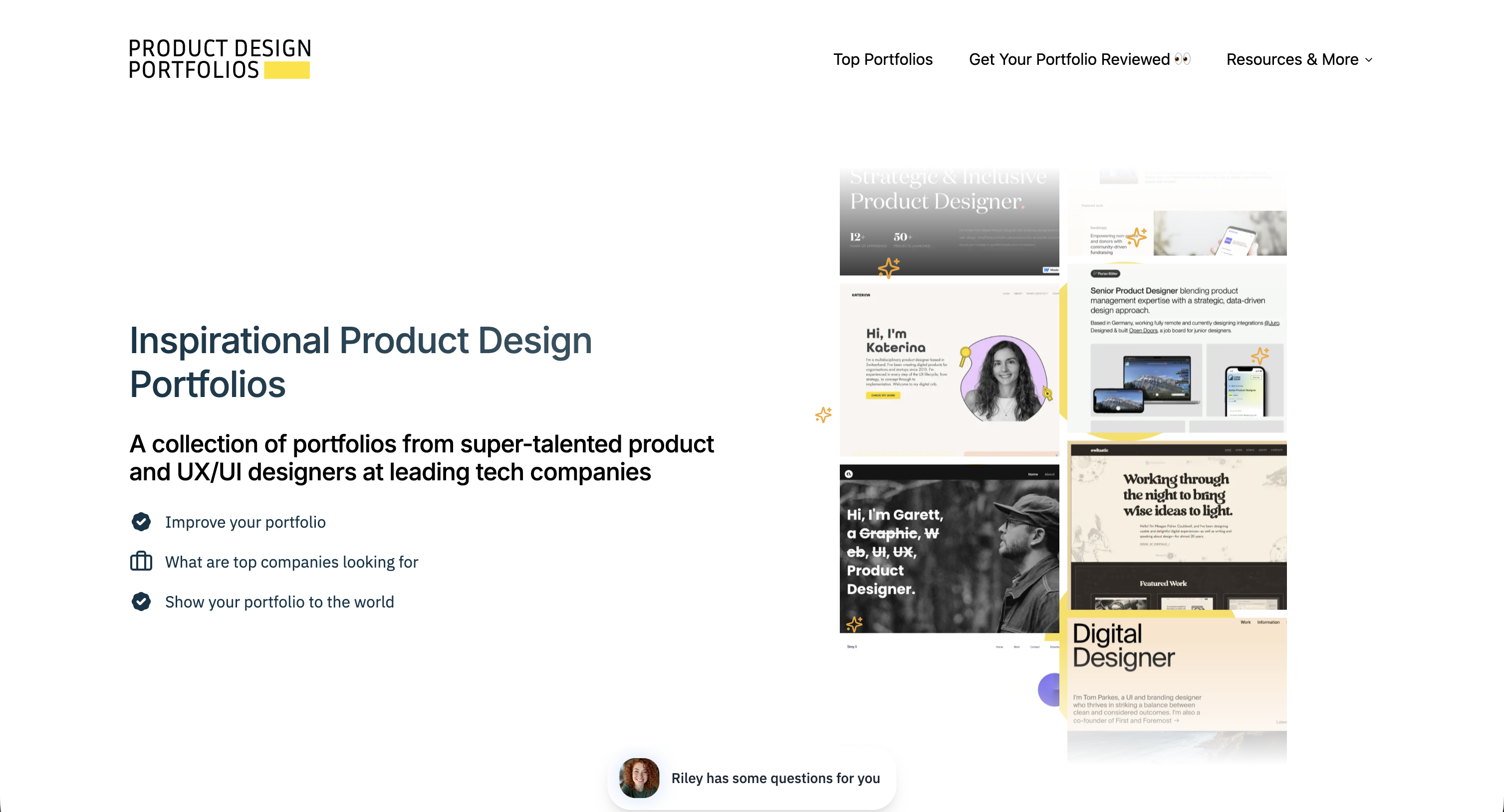
A Collection of the Best Portfolios

Every designer needs a north star.
Not someone to copy. Not a benchmark to measure yourself against and feel terrible about. A direction. A sense of where the industry is heading, what good looks like right now, and what you might want your own work to feel like six months from today.
Why bother looking at other portfolios?
There are a few practical reasons to keep tabs on what's out there.
You get a sense of the competition. This isn't about intimidation, it's about calibration. When you see what other designers at your level are putting out, you get a realistic picture of where you stand and where the gaps are. That's useful information. You can't improve what you can't see.
You spot trends early. Portfolio design has its own cycles, just like product design. Knowing what's current helps you make intentional choices about whether to follow the wave or deliberately break from it.
You figure out how you want to be perceived. This is the big one. Looking at a range of portfolios helps you answer a question that's easy to avoid: what do I actually want mine to say about me? Some portfolios feel technical and systems-oriented. Others feel warm and narrative driven. Some are loud and experimental. Browsing a collection forces you to confront your own preferences and start building toward something with intention.
I've pulled together three collections that I think do a great job of surfacing strong portfolio work across the industry.
Curated portfolio collections
A focused, well-curated gallery of product design portfolios. This one is particularly useful if you want to see how designers at established companies present their work. It's a good starting point if you're early in your career and want to understand what "senior-level" portfolio craft looks like in practice.
UXfolio Examples
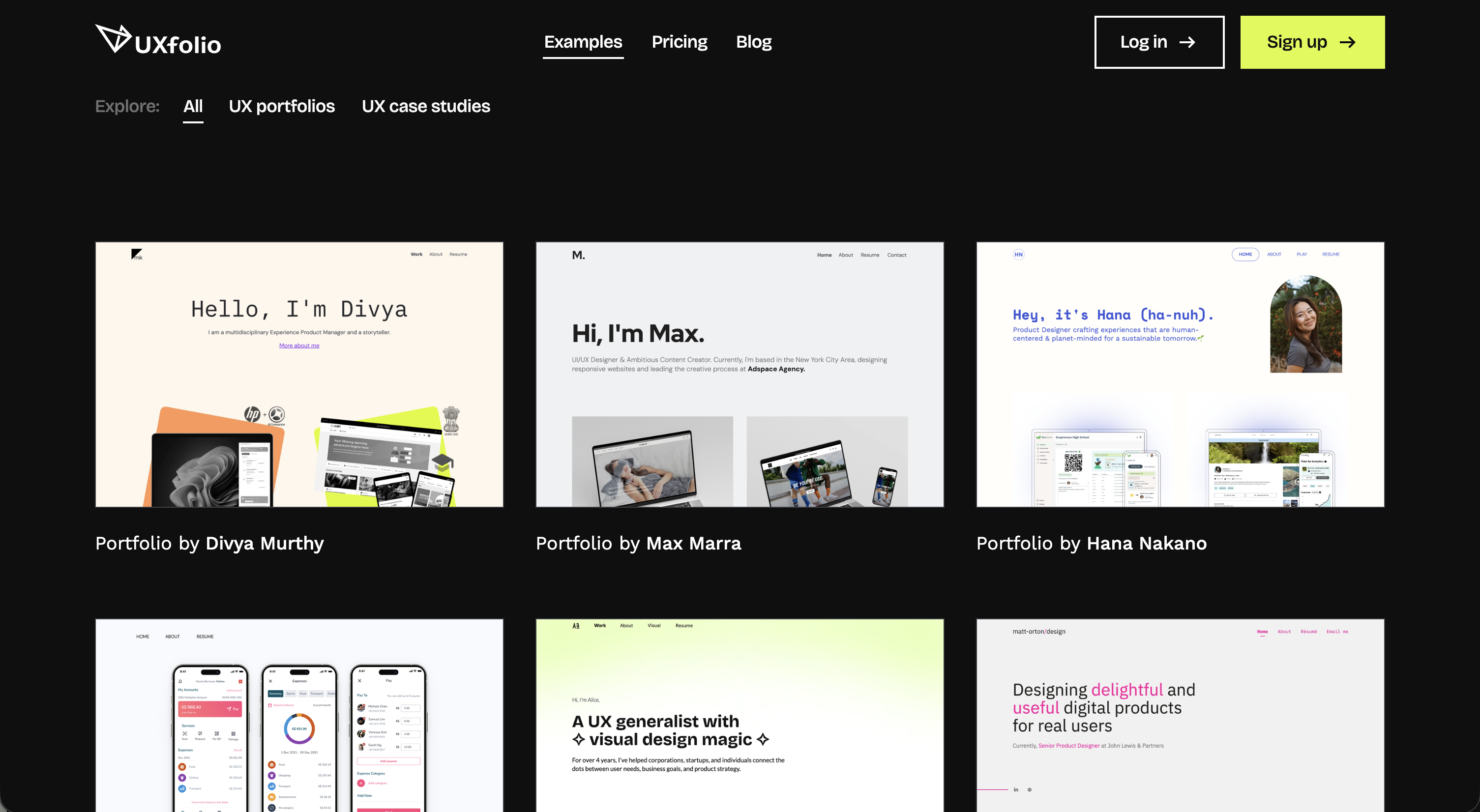
A broader collection that spans different experience levels and specializations. What I like about this one is the range — you'll find everything from junior designers putting together their first case studies to seasoned leads with deep, research-heavy presentations. It's helpful for seeing the full spectrum, not just the highlight reel.
Wall of Portfolios
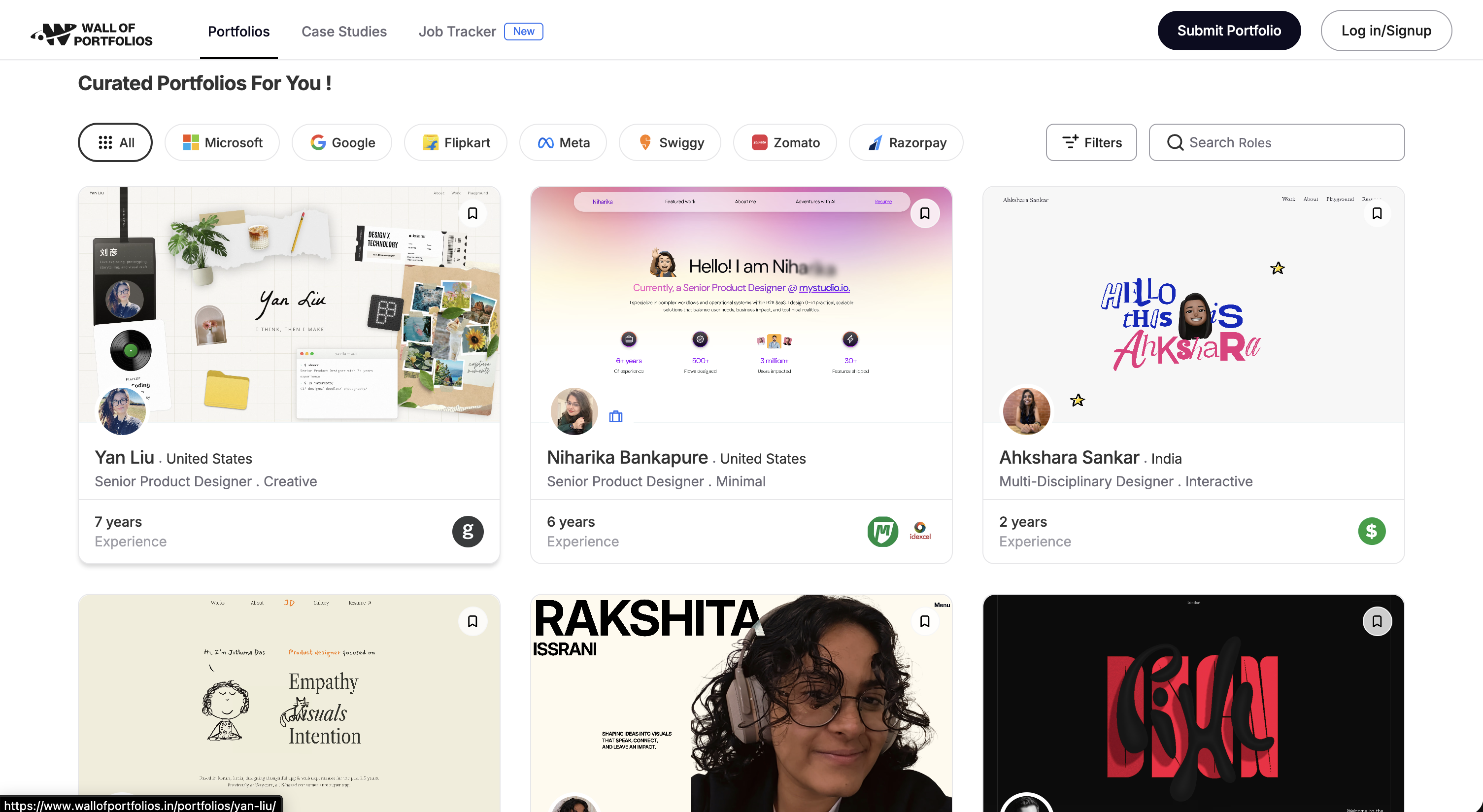
This one lets you filter by company, which is incredibly useful if you're targeting a specific type of role or organization. Want to see what designers at Spotify, Google, or Figma are putting out? You can drill into that. It gives you a sense of what resonates within different company cultures and what hiring teams at those organizations are likely familiar with.
Standout solo portfolios
Collections are great for volume, but sometimes you need to sit with a single portfolio and really study how it's built. These are four designers whose personal sites I keep coming back to — not because they all look the same, but because each one does something distinctly well. They've figured out how to present themselves as a brand, and that's exactly the mindset you want when building your own.
Tobias van Schneider
Tobias has been a reference point in the design community for years, and his portfolio reflects that. It's confident, opinionated, and unmistakably his. What stands out is how seamlessly he blends his design work with his personal brand, the writing, the side projects, the aesthetic choices. Everything reinforces who he is. If you want to understand what it looks like when a designer fully owns their identity, start here.
Simon McCade
Clean, intentional, and immediately clear about what Simon does and who he does it for. This is a great example of a portfolio that doesn't try to be everything. It picks a lane and executes it well. The case studies are structured in a way that makes it easy to understand the work without over explaining, which is harder to pull off than it looks.
Marco Cornacchia
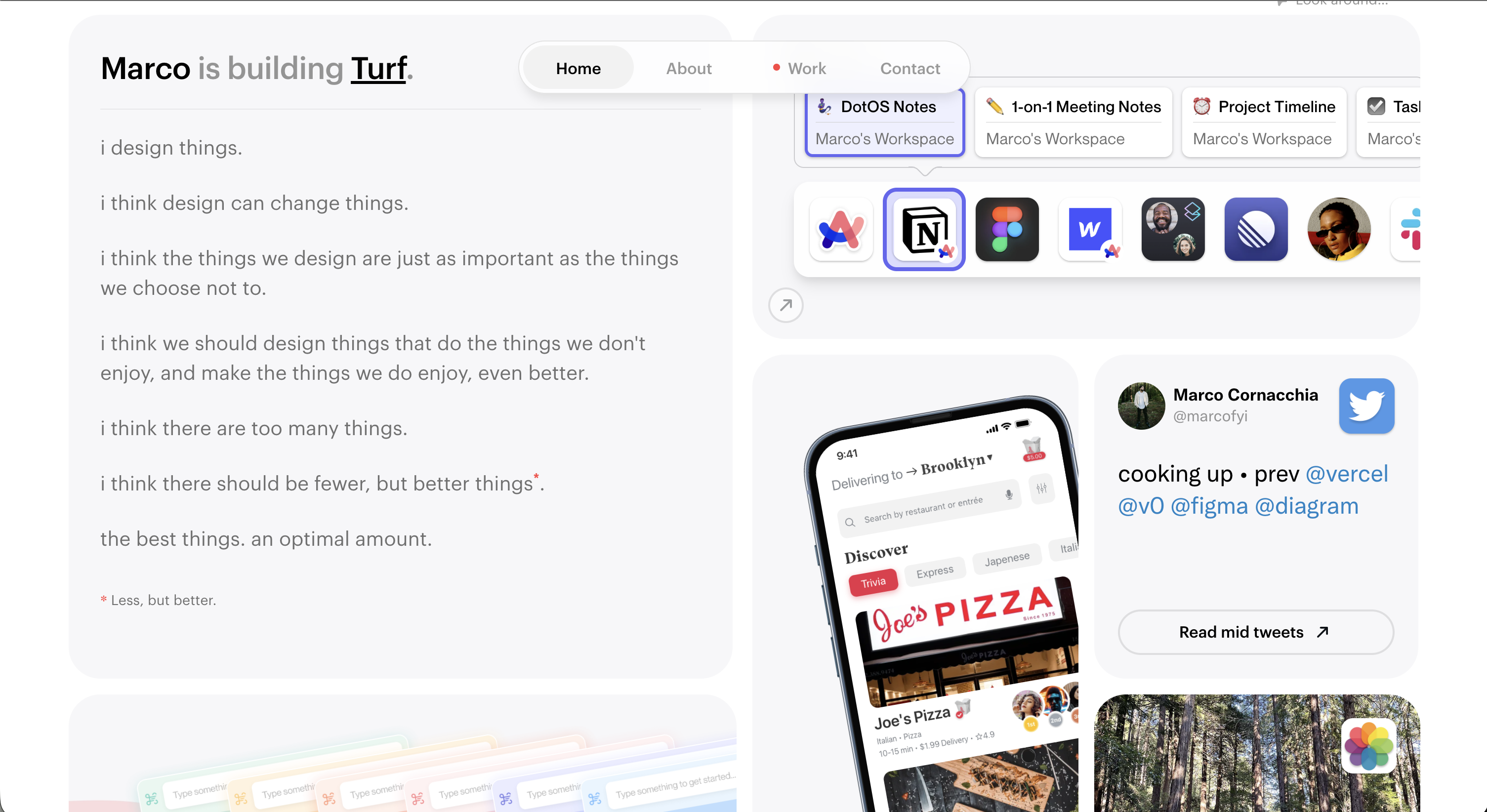
Marco's site is one of those portfolios where you can feel the thought behind every decision. The layout, the pacing, the way projects are introduced, it all feels deliberate. It's a strong example of how restraint and attention to detail can make a portfolio feel premium without being flashy.
Heckhouse
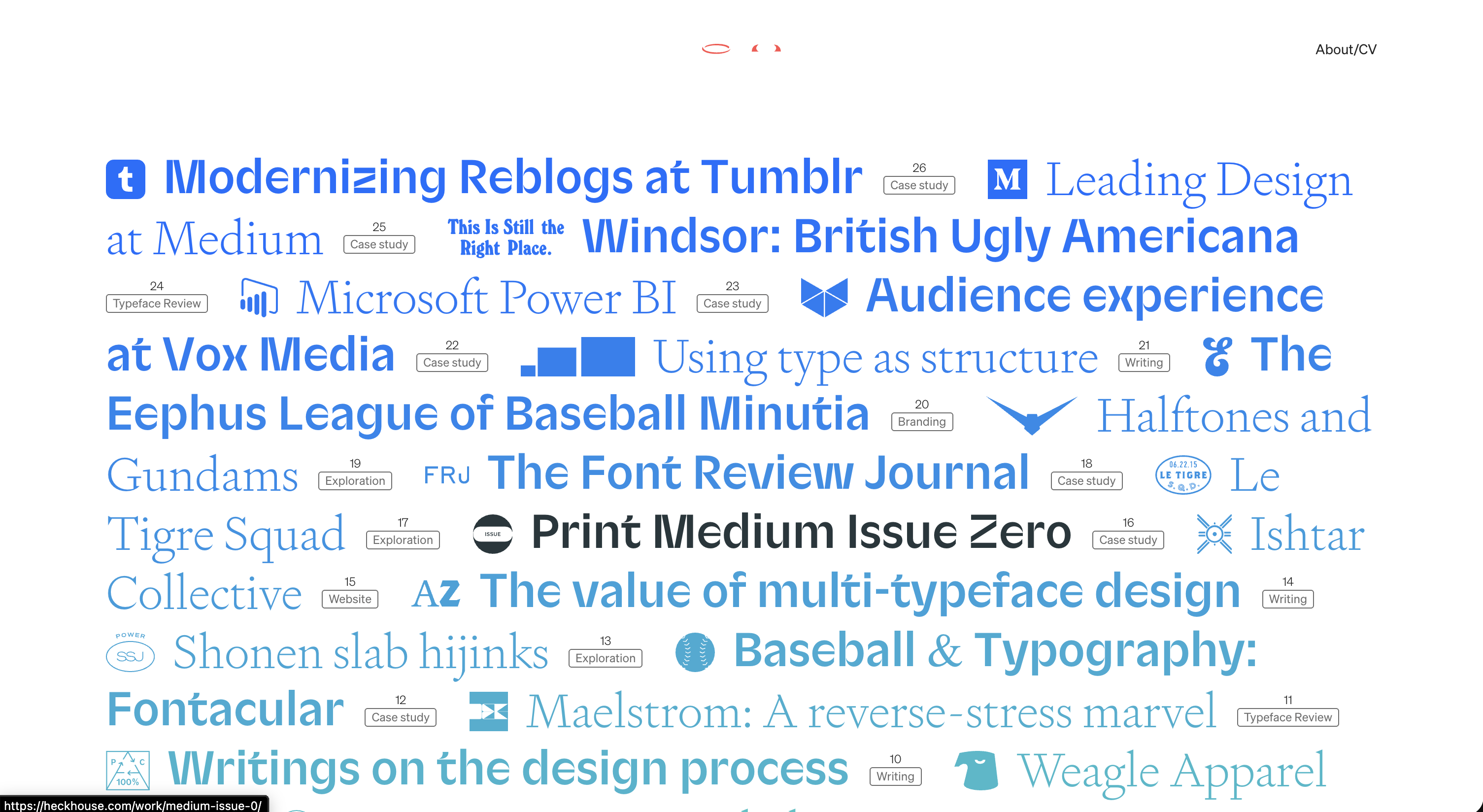
This one breaks the mold a bit. Heckhouse has a distinct personality that comes through immediately, it's playful, bold, and memorable. It's a good reminder that your portfolio doesn't have to follow the same template as everyone else's.
Creative agencies worth studying
Here's where things get interesting. These aren't individual portfolios, they're creative agencies. Agencies are masters at selling work. That's literally the business model. They take complex projects, distill them into compelling narratives, and present them in a way that makes clients and prospects feel something. These are your benchmarks for how to package and present what you do.
Koto

Koto's work is bold, vibrant, and impossible to scroll past without stopping. Their case studies are masterclasses in visual storytelling. Every project feels like it has momentum. Pay attention to how they use motion, color, and composition to make brand work feel alive. The takeaway for your portfolio: energy matters. If your case studies feel flat, study how Koto creates excitement through presentation alone.
Huge
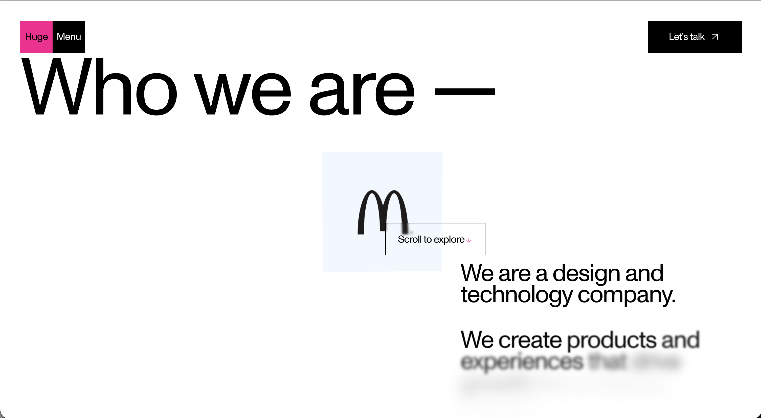
Huge works with some of the biggest brands in the world, and their site reflects that scale without feeling sterile. What's worth studying here is how they balance strategic thinking with visual craft. Their case studies don't just show the output, they frame the why behind every decision. If you struggle with articulating the reasoning behind your design choices, Huge is a great reference for how to weave strategy into storytelling.
Fantasy

Fantasy has worked with big clients and their portfolio presentation matches the caliber of the work. Everything feels cinematic. The thing to take away from Fantasy is how they use scale and pacing. Large visuals, generous whitespace, and a rhythm that pulls you through each project.
STRV
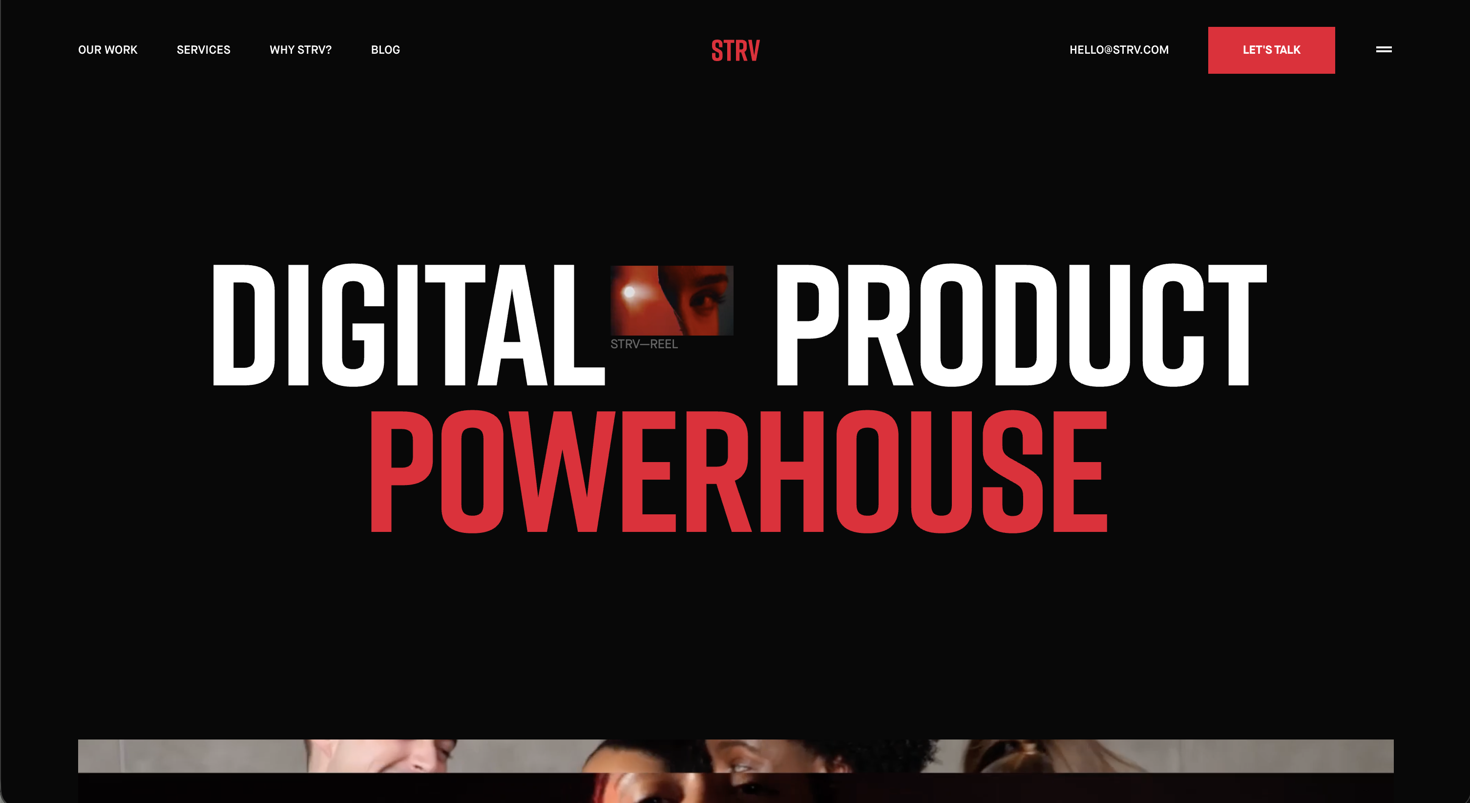
STRV sits at the intersection of design and engineering, and their portfolio reflects that dual identity. Their case studies do a great job of showing the full arc of a project, from concept to shipped product, in a way that feels both technical and polished.
Now, the part where I tell you to be kind to yourself
I'd be lying if I said browsing other's portfolios doesn't occasionally make me question everything about my own. It does. That's normal. You open a beautifully crafted case study from someone who apparently redesigned an entire banking platform while also running a newsletter and speaking at three conferences, and suddenly your own work feels small.
Here's what I've learned to remind myself; you're looking at someone's highlight reel, not their process. You don't see the forty iterations that got scrapped. You don't see the months of doubt. You don't see the version of their portfolio from two years ago that looked nothing like this. You're seeing the polished output of a long, messy journey, the same kind of journey you're on.
The purpose of looking at other portfolios is not to compare. It's to collect. Collect ideas. Collect patterns. Collect a sense of where you want to go. Then close the tabs and go build your own thing.
Inspiration should be a compass, not a mirror. If you're using these resources to find direction, you're doing it right. Your portfolio is yours. It's supposed to reflect where you are right now, not where someone else has already arrived.
Let's not be too hard on ourselves.
Have a portfolio resource I should add to this list? I'm always looking for new collections to keep this updated.