Building a Scalable System for the
World's Top Talent Marketplace
Streamlining processes in the midst of hypergrowth
As Toptal went through a hypergrowth phase, scaling the product practice became a business priority. The company’s ecosystem spanned across multiple user facing portals (Staff, Client, and Talent), internal products (CMS Tool, TopTeam, TopTaste, TopShop), external products (Time Tracker, Screenshot app), and new initiatives launching every quarter.
With so many parallel projects, the lack of a unified design system became costly. Teams often designed from scratch, shipped inconsistent experiences, and created technical debt that slowed the process down. It was clear there was a need to bring alignment, efficiency, and structure back into the design process, and thats when I got hired.
Product
Design System
My Responsibilities
Component Architecture, Governance, Documentation, Project Management, Managed Libraries, Streamlined Processes, Design Office Hours.
Tools
Figma, Figjam, Storybook, Confluence, Jira, Token Studio
Timeline
2½ years
Laying the foundations to scale
When I first joined Toptal, I inherited a decent set of Figma components, but no real structure behind it. Components lacked documentation, there was no shared process, and alot of noticeable gaps between the design library and what actually existed in code. The system had been built by a few early designers who were trying to move fast and stay efficient and that served them well. But as the company grew, cracks began to show.
The components were fragile and overcomplicated. They didn’t cascade properly, and even the smallest UI update required breaking a component apart or stacking more properties on top. Every adjustment became a time sink, and inconsistency slowly crept across products.
Before scaling, I needed to pause, audit everything, and rebuild the structure so the system could actually support growth, not resist it.
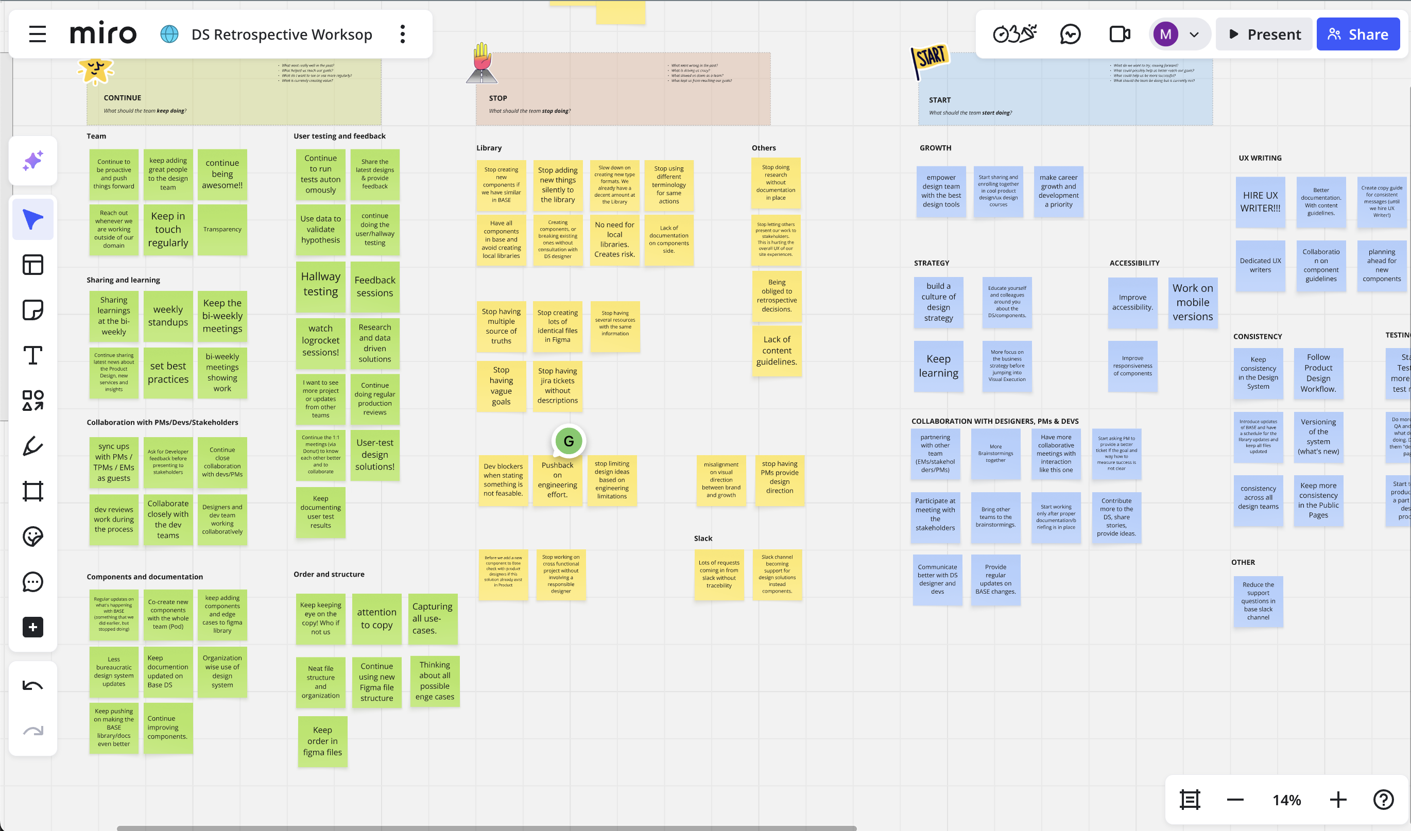
Listening and learning from cross-functional teams
I spent my first few weeks observing, listening and learning. I've read through hundreds of messages on a dedicated ds slack channel, to gauge a sense of what are some FAQs. I also joined product team rituals, interviewed designers and developers, created retrospective workshops and mapped how the existing system was being used in real projects. This revealed where the friction was most acute
Research Goals
- How are designers and engineers currently using the system in their daily workflow?
- What aspects of the design system are working well, and where are the pain points?
- How clear, accessible, and easy to navigate is the documentation, particularly when searching for specific information?
- What specific challenges do teams face during collaboration or when implementing components?
- Are there any gaps or inconsistencies in the system, you know of?
Key Action Points
- Stop neglecting use cases in responsive design.
- Help improve the handoff process between design and development.
- Start creating subsystems for the other platforms that require its own components.
- Improve the component architecture in Figma with more nested properties.
- Clearer process and more formal process for new requests, bugs etc.
- Stop relying on outdated or fragmented documentation.
- Clarity on whats in progress and what's published.
Establishing a formal process
Designers felt uncertain and often times insecure in their workflow. They weren’t sure how to work with the system effectively or what steps to take when a component lacks flexibility or a new component is needed. The system that was meant to guide them had become an obstacle instead of a support.
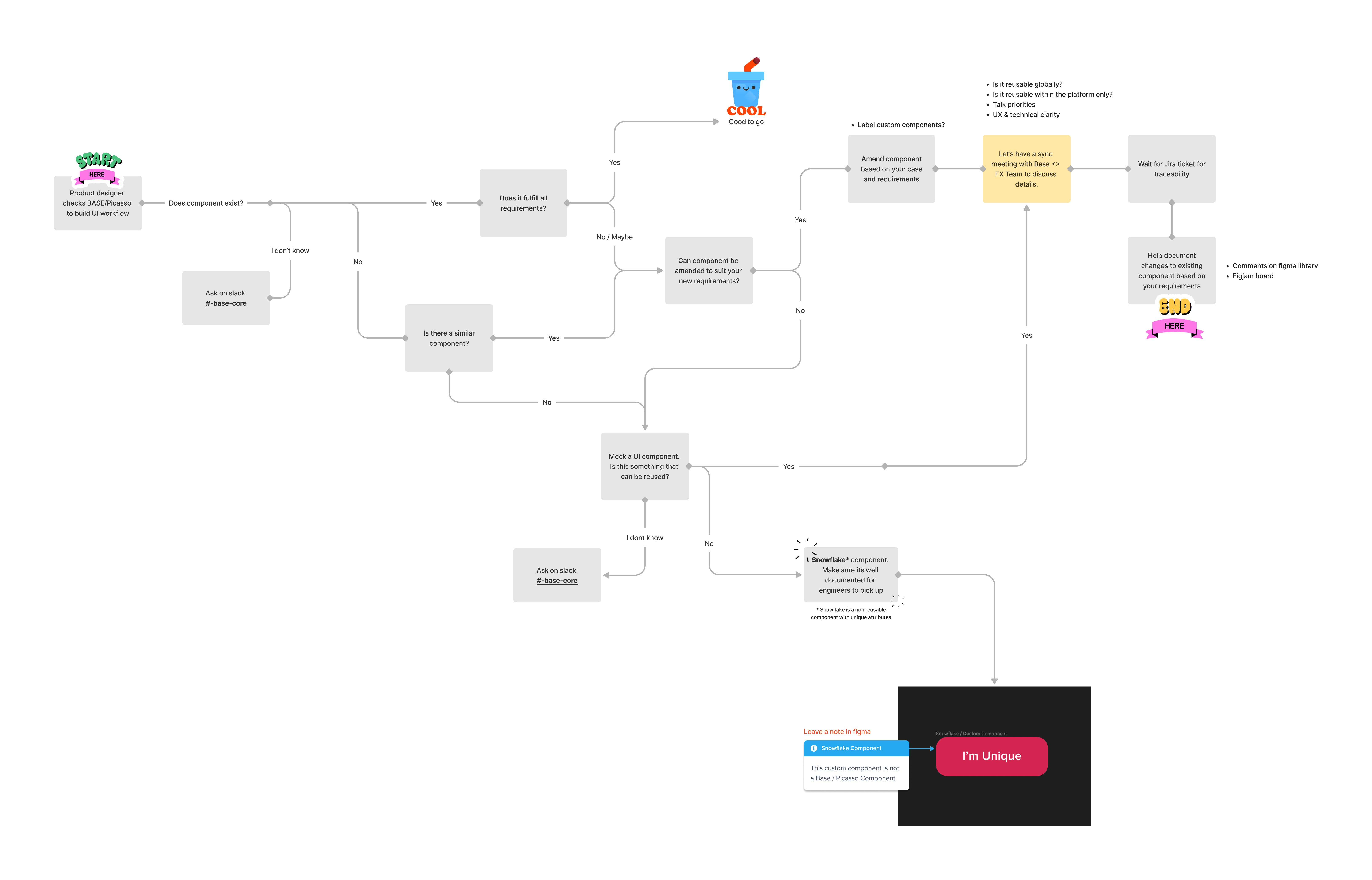
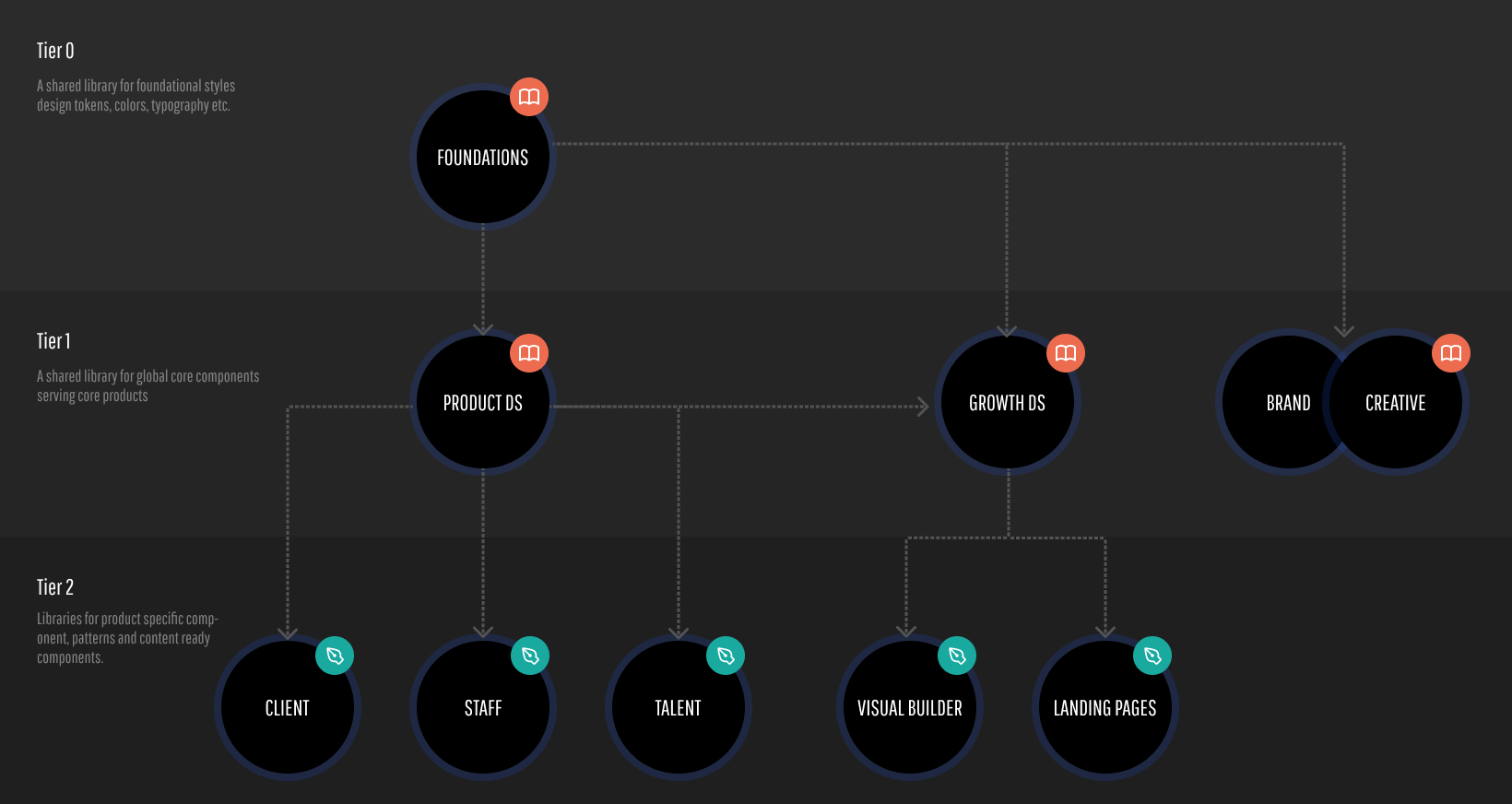
A System of Governance
With an easy flowchart process in place, the next step was to bring structure, transparency, and collaboration to how the system was managed. I introduced a governance model that made the design system not just a library of components, but a living, collaborative product.
DS Office Hours
A cadenced meeting for open critiques, reviews, suggestions and questions. These sessions helped designers gain clarity, share feedback, and build confidence when working with the system.
Contribution Standards
The use of figma branches encouraged designers to actively collaborate and contribute new patterns, ensuring shared ownership rather than top-down control.
Accessible Roadmap
A transparent, always-up-to-date view of what was complete,in progress, what was planned, and how priorities were decided.
Communication & Requests
A single source of truth for designers and developers to open tickets, track issues, and submit new requests through a shared form, reducing back-and-forth and keeping everyone aligned.
Building a system that adapts, not breaks
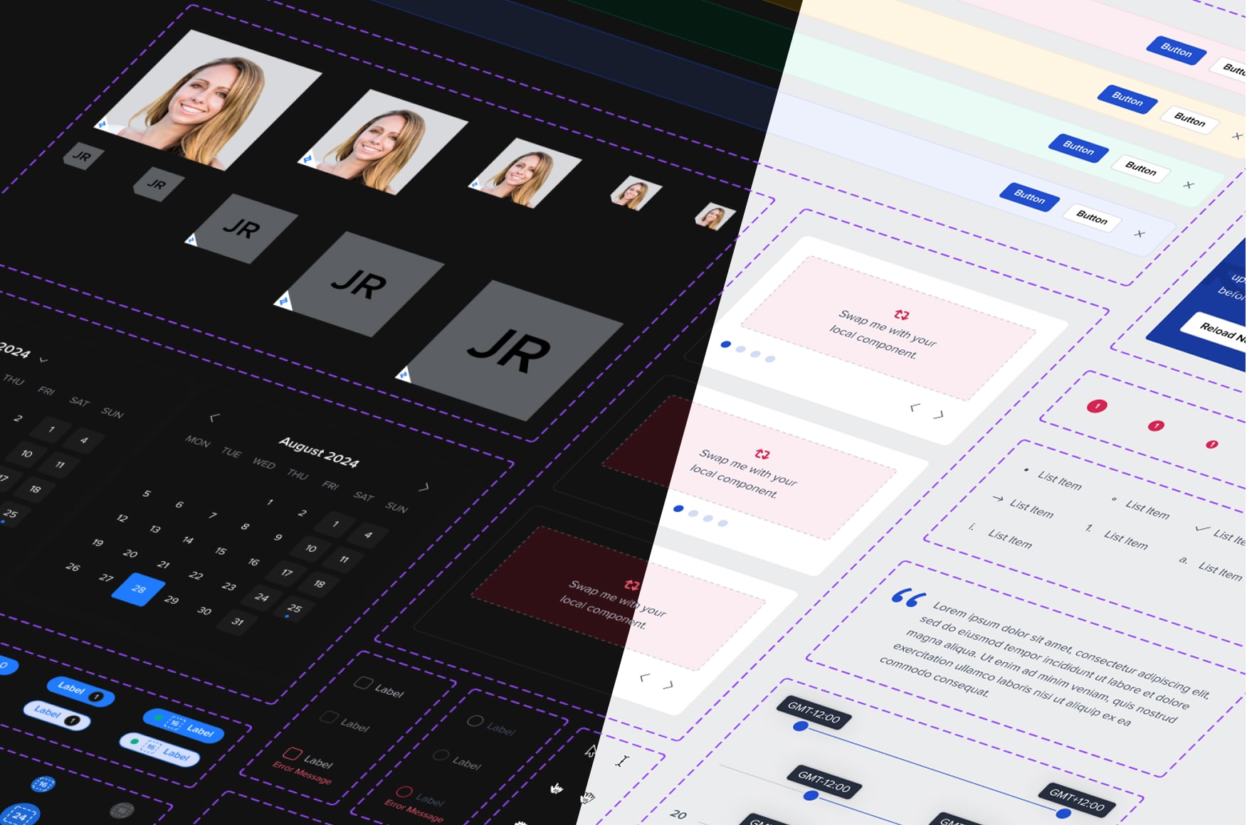
Finishing the migration from Sketch to Figma was the first milestone. I used that moment to completely rethink how the system was structured, making it more configurable, maintainable, and resilient.
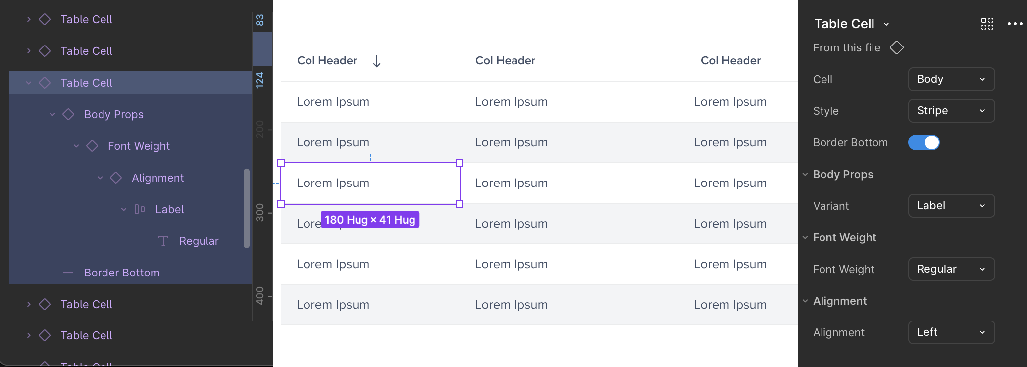
Nested components
I rebuilt the component architecture with cleaner nesting, variants, and boolean properties that aligned with Storybook React naming conventions. This reduced maintenance and allowed updates to cascade through the system effortlessly.
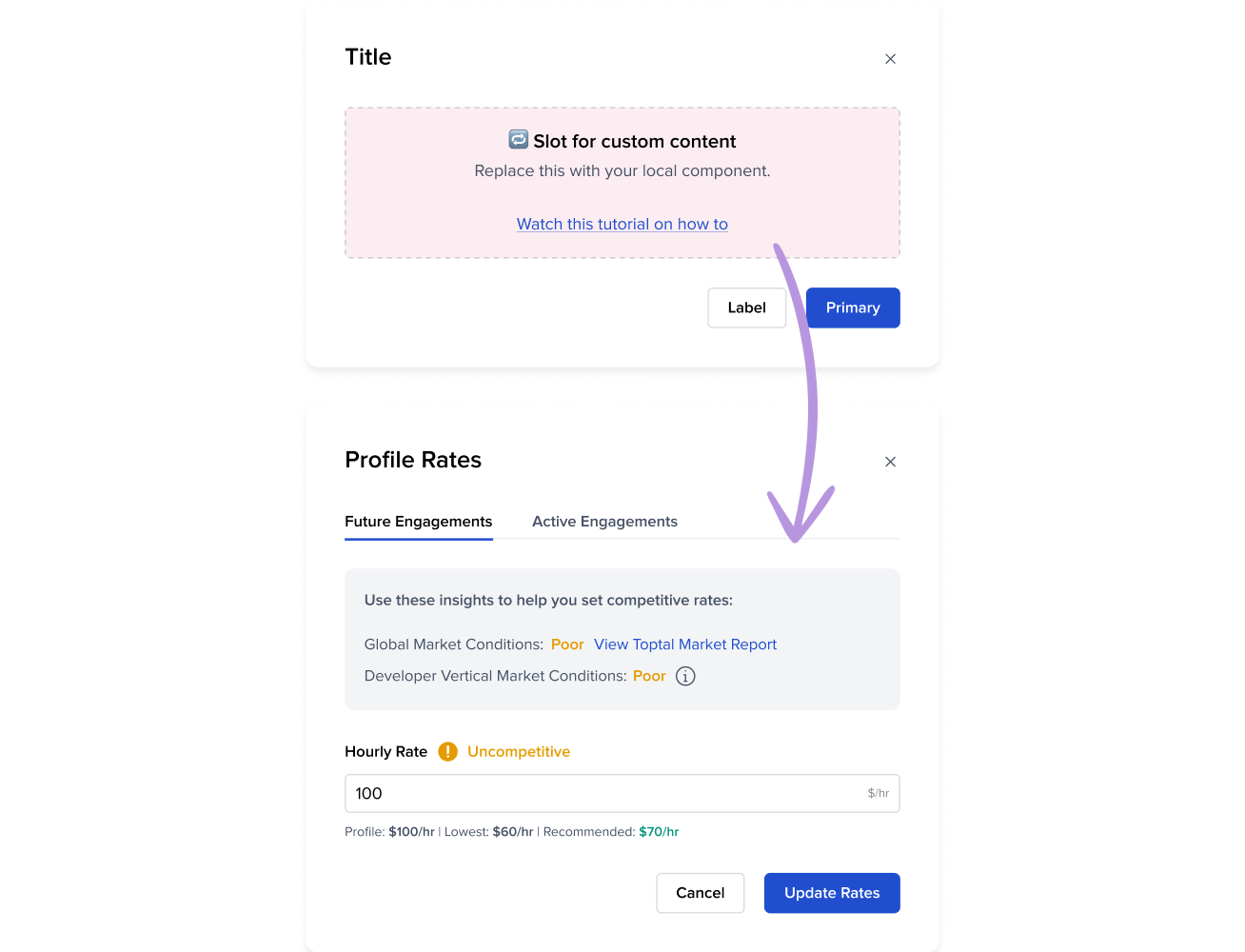
Slot Components
I also introduced slot components which are flexible containers that allows product teams to plug in their own content without detaching from the main system. This small change had a huge impact on speed and adoption, giving teams the freedom to move fast while keeping the design language intact and respecting paddings, margins etc.
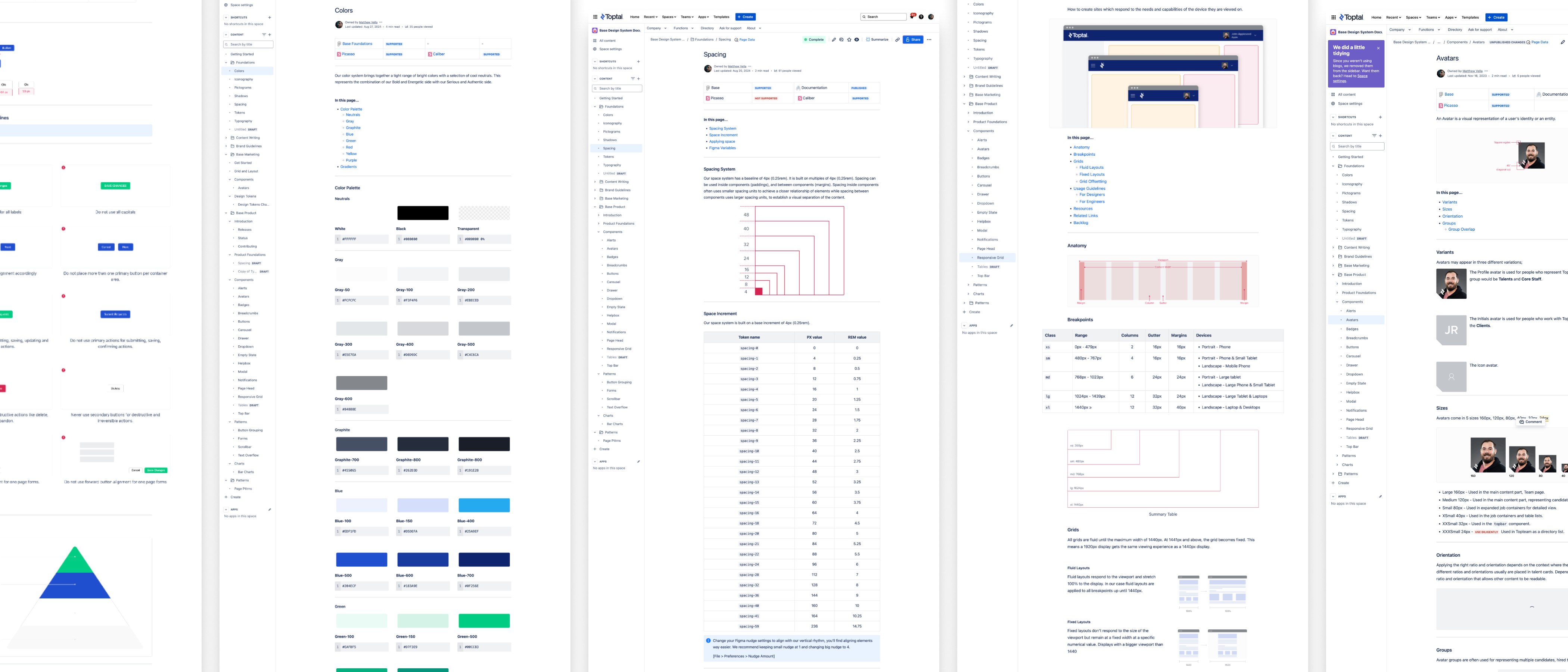
Design Tokens
Styles such as color, typography, spacing, shadows, and radii were converted into tokens and managed through Token Studio, ensuring they stayed in sync across both design and code. The figma variables were centralized within a shared library that served not only product teams but also marketing, creative, illustration, and brand—establishing true cross-company consistency and control at scale.
Creating a documentation hub, that is accessible to everyone
Making information easy to find and accessible, was another big initiative that I took on. Early documentation was limited and buried inside Figma files, which created several challenges: it wasn’t searchable and was only accessible to designers. With no budget for dedicated tools like Zeroheight or Supernova, I turned to Confluence to build a centralized documentation hub.
By embedding live Figma and Storybook iframes, I created a lightweight, searchable, and company-wide knowledge base. This gave everyone from product managers to QA engineers clear visibility into how to use, contribute to, and extend the system.
Real Impact Through Shared Vision
The impact of a design system never comes from tools alone. It is the result of countless conversations, hard work, and collaboration across teams. Building BASE required connecting with people, aligning priorities, and creating a shared vision between design and engineering. Without that alignment, and without users who bring it to life, there is no system.
Over time, the change was visible. Designers felt more confident and cohesive in their workflow. Rogue components decreased. The pace of iteration increased, allowing teams to move fast. The governance process I established encouraged early collaboration, giving designers visibility into how the system evolved across different products. What once took hours to put together a design concept could now be achieved within a single pomodoro session.
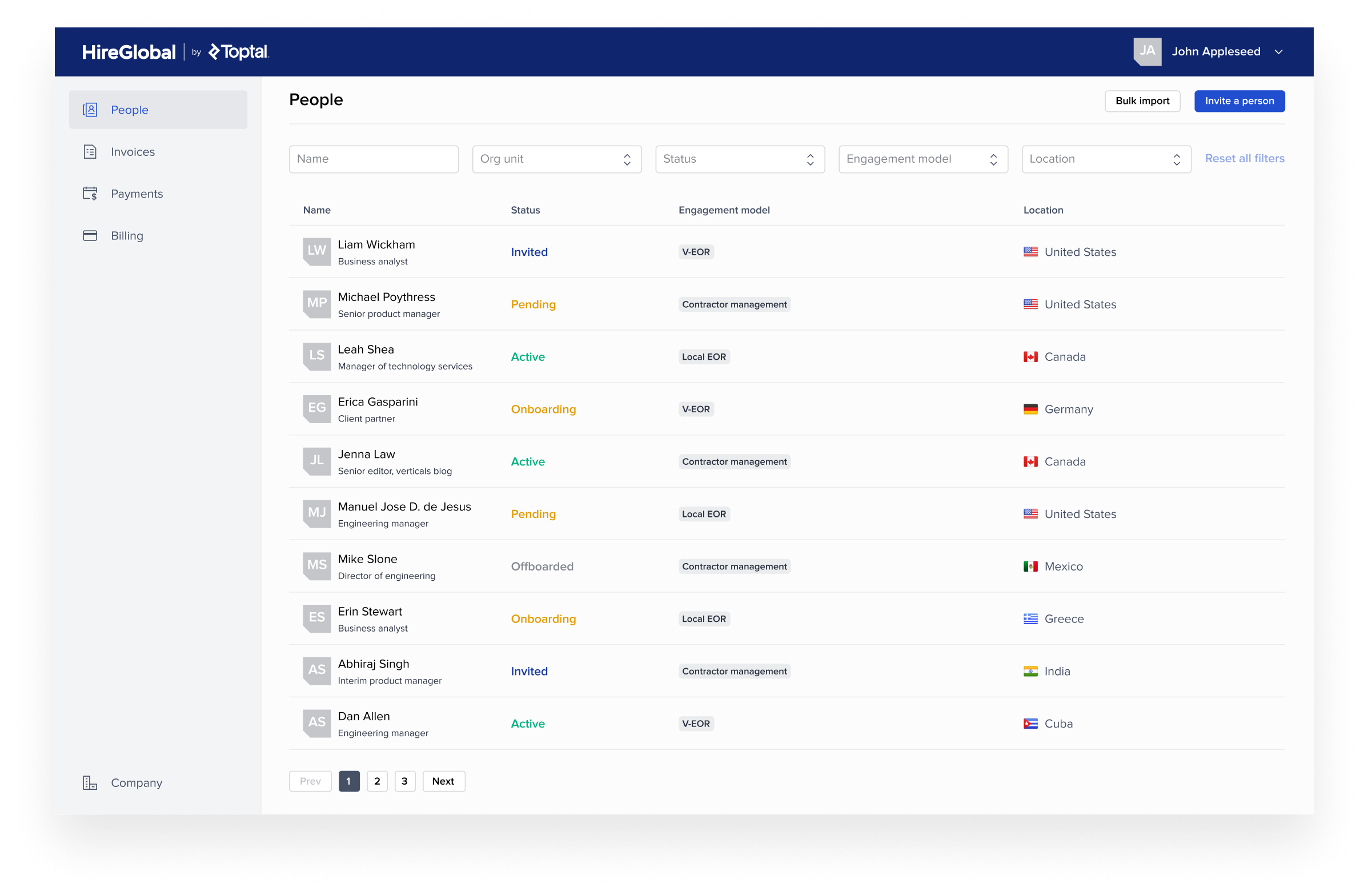
A Success Story: The HireGlobal Launch
In Q1 2024, Toptal launched a new HRIS and payroll system saas tool called HireGlobal. It was a high-stakes project with tight deadlines and ambitious goals. Thanks to the strong foundation of the BASE Design System, the team was able to move from concept to launch in under two and a half months.
An impressive 92% of the UI was built using system components from the BASE Design System. This level of reusability accelerated design and development while ensuring consistency and quality across the experience. More importantly, it validated the benefit of having a system.


“I had the pleasure of working with Matt, who led the design system at Toptal, and I can't speak highly enough of his contributions. Matt is a fantastic designer and collaborator. His documentation is precise and thorough, which has ensured consistency and clarity across projects. He's exceptional at managing the design team's needs while keeping a strong pulse on the business and product evolution.
What truly stands out about Matt is his proactive nature. He consistently delivers above expectations, pushing for solutions beyond the brief. His ability to anticipate and address challenges before they arise sets him apart as a leader. Beyond his technical skills, Matt is simply a great person to work with. He is approachable and dependable and uplifts the team around him.”

Alek Djuric
Director of Product Design“I had the pleasure of working with Matt on the Picasso Design System, where I served as an engineering manager, and Matt led the design efforts. Collaborating with Matt was an exceptional experience; he is not only a talented and experienced designer but also a humble and approachable team player.
Before Matt, our team faced recurring issues with inconsistencies across our products due to misalignment on design standards. However, once Matt took charge, he effectively documented the design system and ensured product designers adhered to it. As a result, our inconsistencies diminished, and for the past year, I haven't encountered any issues.
Matt was a fantastic partner to the engineering team. He consistently considered our perspective, adapting designs to follow UI best practices while making them easier to implement. He was always available to answer questions, offering full support to my engineers.”

Oleksandr Nechai
Engineering Manager“Matthew is a highly experienced designer with a solid understanding of Design Systems and exceptional Figma skills. His attention to detail and ability to self-organize made collaborating with him on the implementation of the design system with the engineering team a very positive experience.
He was able to work effectively with both business stakeholders and software engineers, balancing user experience needs with technical feasibility. In doing so, he successfully laid the foundation for an excellent and efficient Design System. I highly recommend Matthew to any company due to his strong soft skills and proven expertise."

Diogo Saito Takeuchi
Technical Project Manager“I had the pleasure of working with Matt at Toptal, and he is an outstanding system designer! He built a scalable and efficient design system that continuously improved as our team and projects evolved, making a huge impact on the designers who relied on it.
Matt’s deep understanding of both technical and project needs, combined with his proactive approach, really sets him apart. He’s always ahead of the curve, using the latest Figma features, gathering feedback, and ensuring everyone stays in the loop. His problem-solving skills and collaboration with both the design and engineering teams made a big difference in streamlining processes and addressing new component needs.
I can’t recommend Matt enough. His creativity, initiative, and teamwork make him a fantastic addition to any team."